It is often observed and discussed that there are substantial inter-individual differences that can overshadow effects of otherwise effective treatments. These differences can be present in the form of a varying pre-treatment “baseline” that often motivates researchers to express the post-treatment results not in absolute terms but relative to the baseline.
A less commonly discussed scenario is the differences in the individual sensitivity to experimental manipulation (e.g. drug). In other words, inspection of data may reveal that while there is no overall treatment effect (left panel below), for each subject, there is at least one drug dose that appears to be “effective” – i.e. the “best dose” for a given subject. If one selectively plots only the best-dose data, null results suddenly turn into something much more preferred (right panel below).
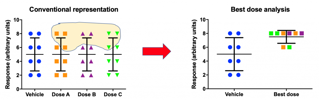
There are a number of publications with this type of analysis. Is this a legitimate practice? As long as this analysis is viewed as exploratory and is followed by a confirmatory experiment where “best doses” are prespecified and their effects are confirmed, this can be a legitimate analytic technique. Without such complementary confirmatory effort, best-dose analysis can be very misleading and may actually be an attempt at p-hacking.
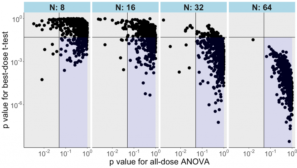
In the following example we generated 400 random numbers, normally distributed and randomly allocated across 4 groups with n=100 per group. Then we drew repeatedly 8, 16, 32 or 64 values from each group and organized them in a table so that each row was one hypothetical subject exposed to a vehicle control condition and to 3 doses of a drug.
Next, we did an ordinary one-factor analysis of variance and saved the p value. After that, the “best dose” (i.e., the highest value) was identified for each row / subject. A conventional t-test was run comparing the control with the best dose (with the p value saved). This was repeated for 500 iterations of random sampling and analyses.
As the plot below illustrates, the t-test for the best-dose analysis often yields “p<0.05” for datasets where the all-dose ANOVA does not reveal any main effect of treatment.
This conclusion becomes clearer with increasing sample sizes – already at n=16, the best-dose analysis finds “effects” in nearly half of the cases. By n=64, it is rare that best-dose analysis fails to find an “effect” using these random numbers.
Is all this too obvious? Hopefully, it is, at least for our readers. This example, nevertheless, may be useful for those who consider applying a best-dose analysis and for those who need to illustrate the appropriate and important role of confirmatory research.
By Anton Bespalov (PAASP) and David McArthur (UCLA)
The R script can be found HERE.
PS After the above analysis was designed and completed, we became aware of a paper by Paul Soto and colleagues that discussed the same issue of the best-dose analysis using different tools.
0 Comments
Leave A Comment